Products | web apps |
VISIpoint kiosks
visipoint |
product designer |
web, android, windows |
product name
role
hardware
visipoint | product name
product designer | role
web, android, windows | hardware

Visitor / Employee kiosk
Responsibilities
- Lead Designer
- User Research
- Prototype Tester
- Information Architecture
- Wireframes
- User Interface Design
- Animations/Interactions
Challenge
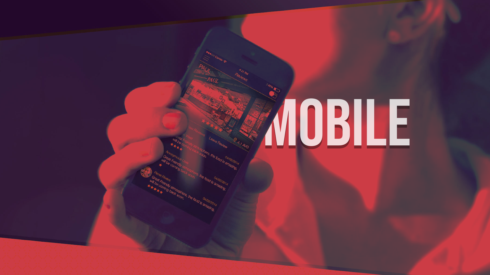
To create a visitor management system for visitors and staff. There would need to be various user groups using the system, it will provide Photo ID badges, up to date emergency lists for evacuation & live information on who is signed in.
solution
A reception based digital management visitor system with:
- Simple visitor sign in
- Instant Photo ID – Badge
- Visitor Pre-Registration -email invite or QuickPass QR code
- Email notifications, to staff
- RFID Staff sign-in
- Multi site management
- Custom branding for front end
- Desktop App – Management
- Report generator – realtime
- Evacuation Docs
RESEARCH |
RESEARCHING EXISTING PRODUCTS
Time was spent researching and looking at similar Visitor Management System SaaS products – several companies at the time of starting this project in 2016 where providing some expensive safeguarding solutions, some where targeting different platforms such as UWP specific builds while we wanted to create an accessible, scalable web based product. Initial research finding found that kiosks where expensive and took up lots of space which put smaller businesses off. It was decided to focus on a tablet based solution which could be easily scaled to a kiosk screen if required.
From the different VMS products we analysed there was a gap in the market to provide Photo ID badges to the system to be printed out for visitors and guests – initial research finding found that most business where keen for this feature that wasn’t available on the market.

information architecture for kiosk & dashboard
client side user journey

Showing the journey a visitor would take on the client side
Sketching the users journey above helped me quickly understand the core functionality of the app, which was then easy to relay back to the development team to review and iterate accordingly. A fully interactive clickable prototype was created for user testing, and feedback gathered. The feedback was used to inform iterative design changes for the following versions and the user testing process carried out at critical times until the prototype accurately represented the flow of the end product.
DESKTOP APP WIREFRAMES
Basic features and functions are wireframed to get a feel for how the desktop management system would function, and link to the client facing application.

Desktop Initial Concept Wireframes
At this point the Visitor Management System was going to contain two main applications:
- Client facing touchscreen Tablet (iOS & Android OS) Web application (Responsive design for kiosks also considered)
- Desktop Management Console Web application. (Responsive design for different screen resolutions)
TABLET / KIOSK APP
The Hi-Fi versions of the Tablet / Kiosk was created using the style guide and grid as shown. For a sense of familiarity Google Material Design foundations and principles were used, this was also used for the Desktop application, to create a cohesive design across the different platforms.

BASIC style guide
DESKTOP APP
We needed to provide a uniform experience through different platforms and devices so we based the final product on Material design principles. Using this framework, we could get a consistency that will enrich the user’s experience and give them a sense of familiarity.

daily log book - dashboard - responsive Web design

Counter mounted kiosk with card reader and scan badge options
LESSONS LEARNED |
Testing
Testing and optimising code and art assets was crucial to speed up loading times if a page took more that 2.5 seconds to load this was too long on an average bandwidth, and changes made accordingly to look at speeding up the testing to avoid user frustrations. More questionnaire and review feedback would have been useful for the initial beta and alpha phases of the development.
INTERACTIONS
The client facing kiosk and counter mounted tablet has many touchscreen inputs and using animations helped influence the user experience of these devices for clear instructions and user inputs. Subtle animations with user interactions proved to be very important during user testing.
SIMPLE MANAGEMENT SYSTEM
Keeping the desktop management system simple was key as adding lots of new features proved difficult to explain to new users after testing, this made simplifying certain features to make them user friendly was key for the success of VisiPoint.
RESEARCHING MORE
Researching existing products could have been carried out better, with better organisation on key features of existing products to help form a digital strategy to not only match leading competitors, but to also do things better and improve valuable features that were missing or outdated.
DHL TIME MANAGEMENT SYSTEM

dhl |
product designer |
web, windows |
product name
role
hardware
dhl | product name
product designer | role
web, windows | hardware

DIGItal signage for airport deliveries
Responsibilities
- Lead Designer
- Information Architecture
- Establish interaction through workflows and usability testing
- Wireframes
- User Interface Design
- System setup and execution
- Adhering to branding and style guidelines
Challenge
DHL needed a time management system for their staff within the DHL Facility at Bahrain Airport, to provide visual representation of all incoming and outgoing consignments with scheduling functionality. The scheduling processes were previously managed with spreadsheets and paper signage was used to relay information. Flight schedule information needed to be coupled with DHL’s internal timing systems, neatly conveyed via branded and visually engaging content shown on large-format digital signage screens at each loading bay.
solution
DHL time management solution is a responsive mobile application, that communicated directly with big screen displays. The solution is an internal web application to allow for flights to be added onto the system, initially the system was deployed for Bahrain Airport. There were 12 strategically placed 55″ LED digital signage screens around the loading bays in the airport. Each flight added to the system was assigned to a zone and queued in order, there is a logical traffic light timing based system, displayed to help employees be more efficient. Reports and analytical data can also be extracted from the system for analysis and review.
OUTLINING FULL BUSINESS REQUIREMENTS
Before the design phase could begin it was important to fully understand the business requirements, this was achieved by direct communication with the client on a regular basis at the beginning. Understanding the internal users of the system and what the users would do to achieve their goals, was key to the success of the project.
The wider picture was to role the system out externally to other Airports in the future so the system had to cater for this and be scalable to be functional in other Airports within the internal DHL network. Initially I conceptualized and prototyped the initial users requirement and made a hierarchy of what key events needed to the completed and in a quick, functional logical manner. This allowed me to focus on the users flow of the web app dashboard, and I then concentrated on what key information needed to be displayed on large digital signage passive screens for the delivery packer (User).

System - Information Architecture
WEB APP PROTOTYPE
In order to understand complex processes involved, I mapped out workflows on paper and then digitally reproduced them in order to circulate amongst the development team. With consistent input and feedback from the development team, a few iterations were required and reworked. From the beginning it was vital to involve all of the team to prevent wasted time and money further down the line of the project.
The wireframes below show the web application building block for the basis of the MVP – these where created to help the everyone understand the main interface components within the application. Various iterations of the wireframes where created in order to give the best User Experience for the end user.

Initial Wireframes - with action descriptions
Low-fidelity wireframes helped me work rapidly and allowed a quicker flow of ideas thereby allowed me to gain a broader view of the way the app worked earlier on, ensuring a more cohesive design.
WEB APP HI-FI SCREENS
Various screen designs were created which was beneficial in showing the stakeholders the collective design process. Using a 12 column grid with consistent columns and spacing helped keep everything aligned correctly and made the responsive elements easier to work with. Its was too time consuming to design and detail each screen within the app, so a set of style guides (‘style tiles’) was developed for the developers to follow and thereby speeding up the whole production process. I was always on standby to answer any questions or fix any issues that came up.

Web App Hi-Fi Screens
The screens above from left to right show adding flight times manually into the system and then showing the full zone detail in a collapsible table. The interface was kept clean simple and minimal to make for users of different levels to quickly access important information, which was then communicated to the front-line staff.
DIGITAL SIGNAGE WIREFRAMES
The DHL digital signage app was built as a web application but was connected to large screens using NTBs (Net Top Boxes). The NTBs allowed us to use out of the box widgets like timers etc that didn’t need developing. So the main focus of the screen was to be informative to the packers (front line) workers that needed to manage loading packages for different flights.

Digital Signage Layout
Option 2 was chosen to develop further from the initial wireframes layout – There was talks about displaying training videos to employees as well so there was a widget left in the bottom right corner to allow for company news, videos etc to be displayed.
HI-FI DIGITAL SIGNAGE TV DISPLAY
The end size of the TV was a 55″ which was as big as we could fit into the different loading zones. There where 12 loading zones in total so each screen was strategically positioned to allow for optimum viewing either overhead or against nearby zone walls.

FINAL DISPLAY ON LCD TV
LESSONS LEARNED |
screen sizes
Working with different screen sizes proved difficult as we wanted to the web application to be usable as a desktop web application and also on a tablet. Multiple testing was done to make sure the most important relevant information was shown to the user.
INTERACTION testing
For the web application to work on both a desktop and tablet web toolkits had to be used for both touch and mouse inputs and allowing for the different animations and states of buttons etc.
SIMPLE MANAGEMENT SYSTEM
Keeping the desktop management system simple was key as adding lots of new features proved difficult to explain to new users after testing, this made simplifying certain features to make them user friendly was key for the success of the DHL time management system.
USER TESTING
There was a very tight deadline so there wasn’t much user testing before the final deployment of the system. More testing and user feedback would have made for a better user experience.