Products | Extended Reality |
Factories of the future

traxr |
product designer |
hololens, mobile, tablet & desktop |
product name
role
hardware
traxr | product name
product designer | role
hololens ¦ mobile ¦ tablet ¦ desktop | hardware

Hololens & Mobile - Data Gathering / Desktop & Tablet - lim system
challenge
build a (lims) laboratory information management system solution to increase pathogen sampling and data recording transparency in the food manufacturing factory workplace (for a multi-national company). linking to sanitation systems to enable simple communication between different data sets. To increase front-line factory workers efficiency by guiding them to sample locations and to improve – general sampling/swabbing practice and digital training and to make sure positive results are responded with the appropriate ‘Starburst’ (a multi-swab process from positive results.) ‘seek and destroy pathogens.’
our high level goals were to:
• make pathogen testing, monitoring & training more efficient and consistent globally.
• give full transparency of testing results to all users.
• create cross-platform lims apps across worldwide business.
design sprint
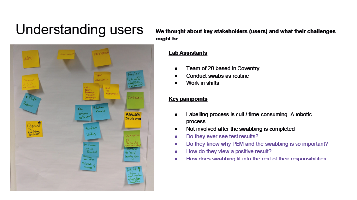
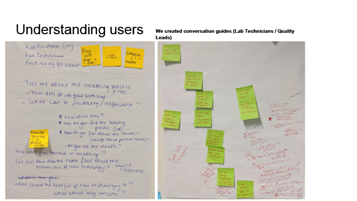
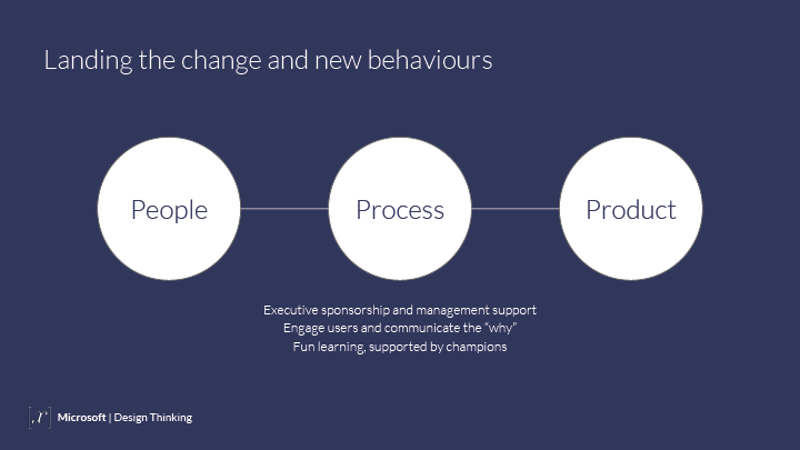
A design sprint workshop was setup with Microsoft to explore users problems & needs – with the intention to find user pain points and issues with existing processes and recognize what needed attention. Understanding the users motivations and frustrations was important to begin the planning stage of the MVP (Minimum Viable Product) to provide the most business and customer value to the end users.


FRONT-LINE USER JOURNEY
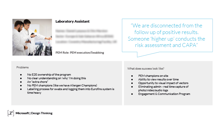
after the design sprint workshop it was arranged that I shadowed the factory laboratory technicians during the daily swabbing/sampling process. Observing, using note taking, data gathering and video footage of the entire end to end processes allowed us to research and interview users of the current procedures and uncover any pain points or potential improvements that could be made, with well structured informal and non-judgemental questions, this research user data was recorded and shared amongst the team.

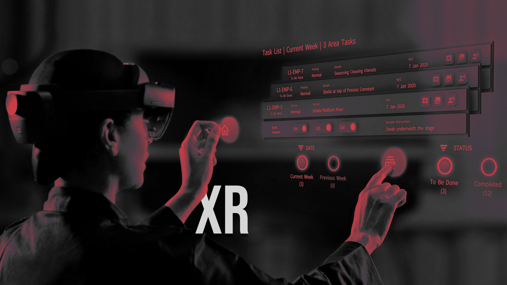
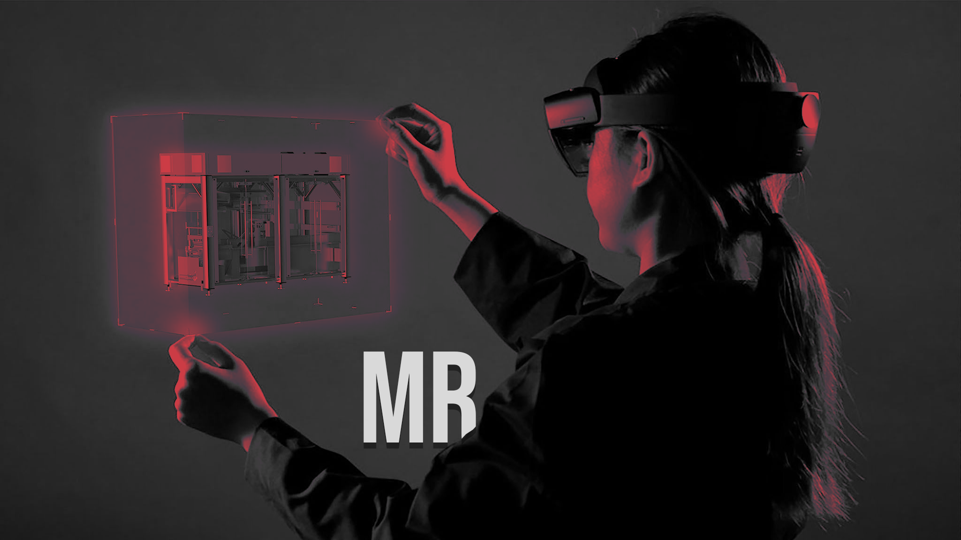
HOLOLENS 1 & 2 |

from the design sprint workshop that was carried out before the project, the primary objective of the project was always about providing the hololens MR headset as a data collection source that would be made functional on the factory for frontline workers. when trying to understand the current and fututre market and business strategies we needed a lower end entry point. both the mr headset and mobile systems would have to achieve functionally the same outputs but both would have very different user interactions and user experiences. it was my role as a product designer to draw the line between both the data collection platforms to create a seamless experience between the two and communicate data to the desktop application that was valuable for both users and higher-level business needs.
INFORMATION ARCHITECTURE
Once the sketches were reviewed it was a good stepping stone to prioritise what interface elements would be needed to communicate to the user, for their ideal journey. This information was gathered during the shadowing of the factory workers and translated into a user journey suited to the hololens technology regarding the safest and most optimal way to perform a swab sample on the factory floor.
The main function of the HoloLens was to aid the user to complete sampling tasks based in factory locations. Using Azure spatial anchors the location data was then used to form patterns, heat maps and trends based on all the data gathered from the user. Using spatial anchors allowed the system to pin point the sampling task location within a 1 meter accuracy. With this being new technology we had to experiment to find out the capabilities of the headset before fully committing to fully fledged features (at factory scale), so proof of concepts led to either validating or re-doing requirements based on the technology and hololens capabilities available at the time of development, which was quite frustrating!!!
Other features which were prototyped and experimented for the proof of concept within the headset were:

inital sketches for hololens 3D interactions
After plenty of sketching ideas and task flows, I wanted to understand a 3D spatial interface and how we would tackle the problem ahead. Some cardboard mockups and 3d objects where placed in different environments to visualise how the user could potentially interact with the 3D spatial interface. It was clear at this point for the MVP deliverable the HoloLens apps main functions would be completing a sampling task and training user to take a sample safely and in a controlled environment.
LOW-FI 2D PROTOTYPE
After extensive user research and requirement gathering, the Hololens 2 was primarily used as a data collection tool, its main user requirements for the sampling tasks were:
• View Daily Prioritised Tasks
• Pin Swab Location
• Photo Log
• Audio Log
• Scan Labelled Barcodes
• Visual Inspections
• Audit Trail
• Corrective Actions
• Risk Assessments
• Way Finding
• Guiding User
• Training Users
A quick 2D clickable prototype was mocked up for the flow of the HoloLens application, the real challenge was the limited field of view, navigating gestures in the headset and to make the UX aesthetically clean and easily understandable.

Marvel app helped show developers and stakeholders the linear cinematic type flow of the task needed to be completed by the frontline factory worker. A simple card sorting exercise was used in order to establish a UI hierarchy. This helped identify a hierarchy of key UI components and how we were going to display them to the user. The black screens are the same aspect ratio 16:9 as this is the FOV in the Hololens, this showed the constraints and limitations of what I was designing for.
After initial prototyping and experimenting a circular UI animation system was expanded on as this felt natural and organic from an aesthetics stance.
HOLOLENS PROTOTYPE
After extensive user research and requirement gathering, the Hololens was primarily used as a data collection tool, its main user requirements for the sampling tasks were:
• View Daily Prioritised Tasks
• Pin Swab Location
• Photo Log
• Audio Log
• Scan Labelled Barcodes
• Visual Inspections
• Audit Trail
• Corrective Actions
• Risk Assessments
• Way Finding
• Guiding User
• Training Users

Figma – Interactive HoloLens Prototype
The main feature from the initial prototype was to display all the tasks as task cards in the HoloLens, this enabled the user to quickly scroll through their task list and select the task to be done. The HoloLens also used the 3d spatial anchors to locate the user and display the nearest task to be done, based on a geo-location. Using subtle wayfinding arrows the user was also guided to the task location in the shortest and safest route.
Using vector graphics in Figma allowed me to quickly create a 2D useable prototype to establish the user flow for each task to be completed, this really helped convey the 2D prototype into a 3D scene, and gave the developers the concept of what needed to be achieved.
There were various task types to be completed these consisted of:
- Routine Task (Standard Task)
- Ad Hoc Task (Standard Task)
- Custom Task (Standard or Risk assessment Task)
- Starburst (Risk Assessment)
Each of these task types has different statuses throughout the task lifecycle:
- To be done
- In progress
- Samples Ready
- Suspended
- Awaiting results
- Completed
- Incomplete
Throughout the journey of taking the samples in the factory the desktop displayed to the user the exact status of the task at any given time, to give the end user complete clarity of the task status.
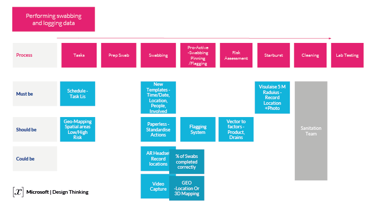
TAKING THE SAMPLES
There is a pre-sample setup this involves placing barcoded stickers onto plastic zip tie bags, the correct number of bags and samples is shown on the desktop for each daily sampling routine task.
Once the user is in the correct area, the user is then encouraged to look around their environment and scan for any potential dangers or dirty areas within the factory. Once the user has chosen an area then a 12cm x 12cm grid is overlayed and pinned, this is the location of the swab. The user is then encouraged to take sample, scan barcode and then return the swab into the post swab bag. The user then has to take at least 2 photos of the area sampled one close up and one distance to give context of the swab location, they can take more if needed. The photos are time and location stamped and then viewable on the desktop application.
AUDIO stamp
The user is not required to leave an audio recording but they can add a up to 2 minute audio recording, which can be transcribed using Azures voice to text service, all audio & photo files are linked with each of the different task types that can be taken in the factory. The Photos and Audio files can be edited before each task is submitted to the cloud to eliminate errors.
API – BOOKING SAMPLES
Once the samples are taken and ready, they are then sent to the testing lab, each sample is booked for collection through the desktop app. This is automatically generated through an API, which automatically raises a PO and notifies the testing lab that the samples are ready for collection. As soon as the samples are tested in the lab, if there are any positive results, the related tasks are instantly flagged in the desktop and a risk assessment task is then automatically created.
The risk assessment task is classified as a high priority task and depending on the location and pathogen type tested an emergency response is required by the team. Once all the risk assessment criteria has been assessed then a starburst task is created and linked to the initial positive result, this keeps a quick and easy reference point for the stages of the starburst task and all elements of the tasks are traceable.
RISK ASSESSMENT TASK
When a positive result comes back from the testing lab, a Risk Assessment task is instantly triggered, with notifications to the desktop & headset and the Starburst task is then created, there are 3 levels of the starburst task:
- Pre-Sanitation – (6-12 samples at positive location)
- Post-Sanitation – (6-12 samples at positive location)
- During Run – (6-12 samples at positive location)
These are encouraged to be taken as soon as possible to find the source of the pathogen outbreak. The starburst tasks consist of taking multiple samples at 1 meter spacing up to a 5 meter radius from the initial positive sample. While completing a Starburst task concentric circles are animated and mapped onto your 3D environment which are visible in the HoloLens to show the distances of all the samples this enables any pathogen outbreaks to be traced and logged in a transparent and controlled environment. The swabbing area is clearly defined to the user, displaying in the headset the areas to take samples to be tested further. All data is recorded both visually, spatial anchors and optional voice recordings can be taken as well to share with the factory teams.


DESKTOP & TABLET |
INFORMATION ARCHITECTURE

After the design sprint workshop ‘Must Have’ elements were put together for information architecture. This helped form a clear direction as to the most valuable features and functions that the desktop app needed to perform. Essentially the current swabbing process involved lots of paperwork / spreadsheets and reliant on third party (lab testing) company to supply the results. The proposed desktop application was going to use an existing API to communicate real-time testing results into the traXR desktop app from EuroFins. It was useful to work backward to see what was already possible from a digital perspective, to help learn and make clear choices. this intern saved time and added value to the stakeholders.

Figma - Desktop - interactive prototype linking screens
DESKTOP PROTOTYPE
An interactive clickable wireframe for the desktop app was quickly mocked up, this helped us inform a basic skeleton structure of the product, to get a feel for all the system components and usability elements that would be needed. Figma was used to quickly explore a working clickable prototype that was shared with the team, real users and stakeholders for initial feedback. Figma software uses vector based graphics to build the foundational UI elements, this makes for an easier way to create a Design System to be scaled and shared for cross-platforms for the traXR product.

Desktop - interactive prototype – GIF animation
MID-FI PROTOTYPE
After some quick internal user testing, reviews, feedback and some ideation some design iterations were made on the Low-Fi prototype – a Mid-Fi prototype was produced, now the columns, margins and gutters were put into place to give a nice aesthetic layout. Different shades of greyscale contrast were used to help show a hierarchy of information. The optimal display size ratio is 16:9. this was useful to get a clear outline of the blocks and components needed to make a responsive web desktop application that displayed critical information consistently on optimal and smaller screen resolution and different tablet screen sizes.

Columns 20, Gutter width 20, Column width 55
A Design System started to be incorporated into the prototype. The foundations of Material Design was used with the basic principles of interactions and animations to allow for a beautiful cross platform experience between all the apps. Using components in Figma meant that the layout and UI components could easily be linked to master components. This sped up the production pipeline especially when shared graphical assets are needed between different platforms, and coherently communicated information to the user.

Mid Fidelity wireframes for prototype – GIF animation
The Mid-Fi prototype was used for usability testing to make sure all elements of the design were easily understandable to the user, with a natural cognitive hierarchy for the navigation menu and displayed components. Iterations and design changes were made to the prototype as we progressed with the products development. Once these designs were initially signed off the developers could begin planning for the foundational programmatic approach and which frameworks would be most appropriate to implement, for the success of the product.
DESIGN SYSTEM
again, with further iterations and adjustments on the Mid-Fidelity prototype this led to creating a primary and secondary colour palette with gradients, images, visual alerts etc. along with the typeface options to remain consistent throughout the traXR products. Following on from the TraXR branding guidelines a Design System was beginning to be integrated into the Desktop product. The colour palettes, typography and UI components are used across different platforms. The two other platforms are the hololens and mobile apps (iOS and Android).

Primary and Secondary Colour Palette options

Desktop font options- ‘Source Sans Pro’ -Light & Dark themes considered
HI-FI PROTOTYPE
A final beautiful clickable prototype was created to allow us to create some reliable usability testing, after several iterations the final aesthetics and user experience was adjusted to suit the users and business requirements. Where applicable all the animations and interactions were shown in the Figma prototype to give a pixel perfect representation of the final product before it was built. The Figma files were shared with the developers so they could extract code snippets, icons, font sizes, pixel spacing, margins, padding etc with ease. If there was any issues, the problems could be raised and dealt with efficiently to speed up production time.
Once the colour palette and font were selected for the Design System, these primary and secondary colours were used throughout the rest of the different platforms (HoloLens and Mobile applications) this allowed for design consistency throughout all the platforms.

Figma - Design System UI components

Desktop/tablet HiFi- Full clickable responsive prototype - Figma
DESIGN SYSTEM ICONS
An outline icon set was designed for easy recognition and integrated the material design guidelines for the creation of these icons. Most of the icon set was accompanied by text onscreen, to help guide the user as icons alone can be very confusing for first time users of any product.
Desktop Icons - Design System
DATA VISUALISATION
We adopted Microsoft Azure Cloud (since we are partners with Microsoft) with data brick integration, this helped us build the AI and Data Predicting trends with patterns. Using Power BI to setup and drive the data sets helped higher management look at trends and easily access the efficiency of staff members, number of positive results over time, pathogen types and outbreaks, effect on air humidity with outbreaks etc. Using Power BI also enabled us to integrate data with tableau, which was used for analytical data by the client. In some cases, we used sensors located in the factory to help display different data sets to predict patterns and trends that could occur. This enabled problems to be fixed before they occur, this helped save the clients line production downtime, which intern saved the factory money and product recall.


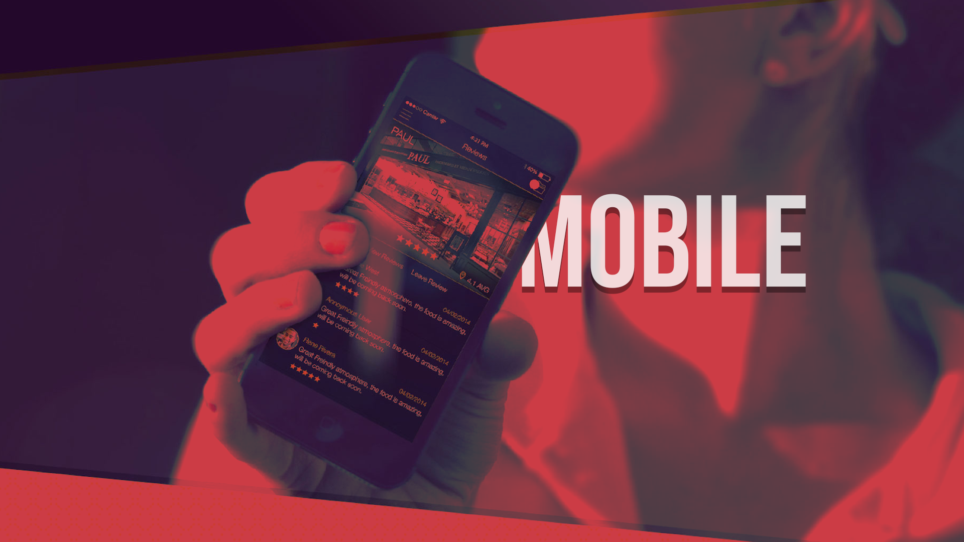
Mobile AR |

INFORMATION ARCHITECTURE
from the design sprint workshop that was carried out before the project, the primary objective of the project was always about providing the hololens MR headset as a data collection source that would be made functional on the factory for frontline workers. when trying to understand the current and fututre market and business strategies we needed a lower end entry point. both the mr headset and mobile systems would have to achieve functionally the same outputs but both would have very different user interactions and user experiences. it was my role as a product designer to draw the line between both the data collection platforms to create a seamless experience between the two and communicate data to the desktop application that was valuable for both users and higher-level business needs.

After initial concepting the task list was the most important part of the application as all of the current daily and prioritised tasks. A quick and dirty prototype was put together using Figma, this allowed for quick user testing to validate users’ decisions and thought process when using the mobile phone.
Once some iterations and product decisions were made with the Low–Fi Prototype this led onto the final Hi-Fi prototype which mirrored the HoloLens in basic functionality but on a mobile device.
MOBILE LOW-FI PROTOTYPE

FIGMA QUICK PROTOTYPE - USER TESTING
MOBILE HI-FI PROTOTYPE

MIRRORED FIGMA MOBILE PROTOTYPE - USER TESTING & VALIDATION
ANIMATIONS / INTERACTIONS / TRANSITIONS


LESSONS LEARNED |
PERFORMANCE TESTING
It was critical to try and hit 60FPS with the HoloLens app as when complex shaders and lots of geometry where introduced there where significant performance issues. When the frame rate of the HoloLens app drops under 40 FPS there was noticeable latency which led to nausea for the user, so aiming for 60FPS was the teams benchmark to achieve a comfortable experience for the user. To achieve this we used optimised shaders, geometry, limited objects and other code optimisations. Performance testing on the Mobile & Desktop application also proved invaluable to enable realtime data to be passed as quickly and efficiently as possible between the different platforms to avoid user frustrations and confusion.
INTERACTIONS
With such a quick turn around project, there wasn’t much time to do user interaction testing. With the HoloLens being a new 3D paradigm, it meant there was a lot of unknowns as to how a first time user would respond to certain interaction inputs, animations, 3d buttons, transitions, noises, FX and voice commands. So very quick rapid prototyping and 3D practical experiments where needed to test, using cardboard cut outs and boxes placed in areas helped understand how the user could best interact alongside physical objects and UI elements. The ‘air tap’ interaction of the Hololens can prove difficult for some people, so initial good people management training was important for first time users to understand this new paradigm. For all first time users of the HoloLens headset it was advised an initial user orientation training session was undertaken to allow the users time to understand the HoloLens interactions and technology.
HOLOLENS FIELD OF VIEW
Although the HoloLens 1 was a cutting edge piece of hardware, it is only a prototype!! one of the biggest constraints is the field of view (FOV) as this is quite restricted in the headset. The challenging problem was to keep the users gaze and attention focused on the task in hand. Using look at 360 floating cursor arrows for viewing points of interest was invaluable. For positioning users for optimised viewing angles during training, animating footprints, specific targets on the ground and POI also proved useful to keep the user engaged with a limited FOV.
AUDIO FX
Overuse of sound effect and voice overs proved irritating after several uses, so in future to be optimal with voice over instructions and voice cues, as this damaged the UX in some areas of the app, and we added an option to turn of voice instructions. Also being very subtle with sound FX for button hover and selection states as its important to let the user know they have input certain commands, but over use can destroy the user experience of the training application.
VOICE COMMANDS
Voice commands where added to all the navigation buttons in the app, they popped up when the user button gazed for more than 0.5 seconds. The issues we had was the working area of the Flexwrap in the factory was very noisy and loud and the HoloLens mic struggled to register user voice commands. The HoloLens 2 however has directional microphones that pick up sounds from the user with any loud ambient noise around, apparently!!! (This needs to be tested as I’m still convinced VCs would work in a loud factory environment that the Flexwrap was in!!!) More testing in the factory environment would have been useful, to not waste valuable development time, on certain features.
USER TESTING
User testing was so important throughout the development life cycle and actually completing the practical swabbing tasks proved to be invaluable that required the end to end process. This allowed us to tweak and modify certain task procedures in order to fit with the technology, in the most user efficient way.