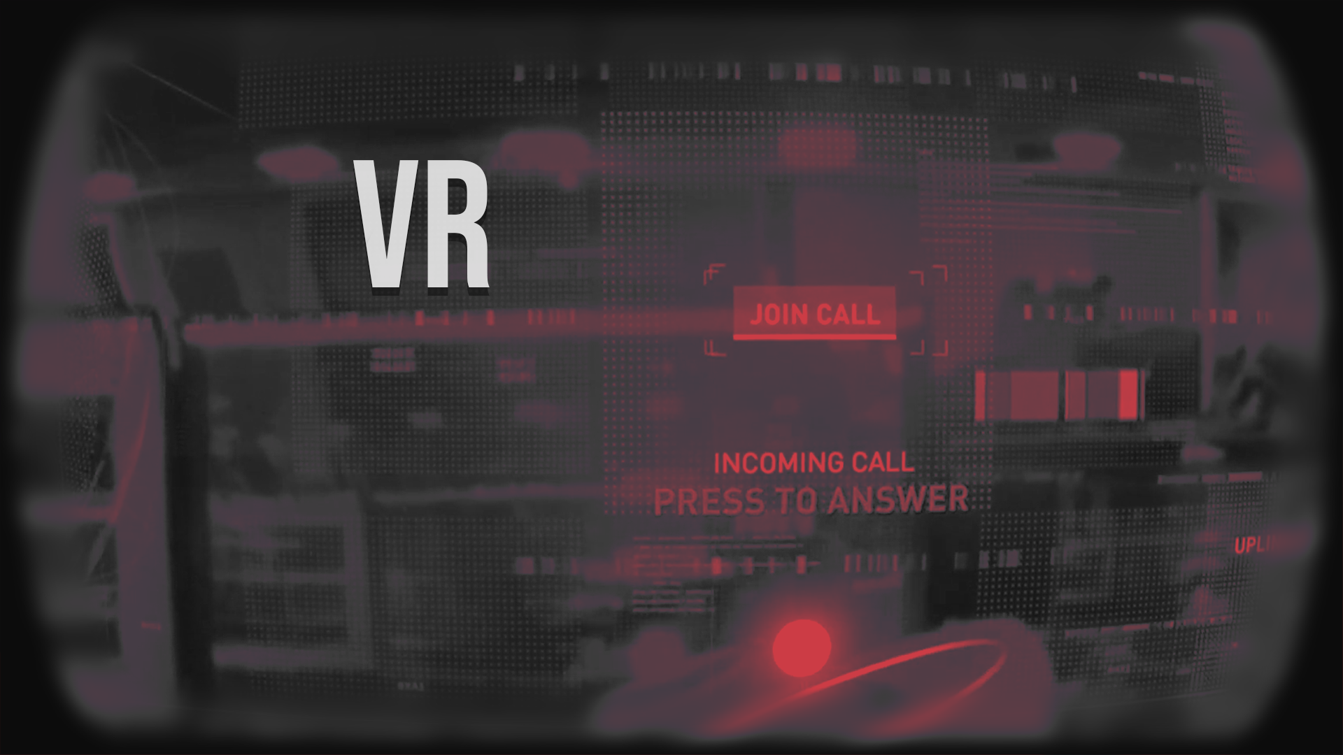
Products | virtual Reality |
Assassins Creed Nexus
assassins creed nexus |
product designer |
Quest 2 & 3 |
product name
role
hardware
assassins creed nexus | product name
product designer | role
Quest 2 & 3 | hardware
challenge
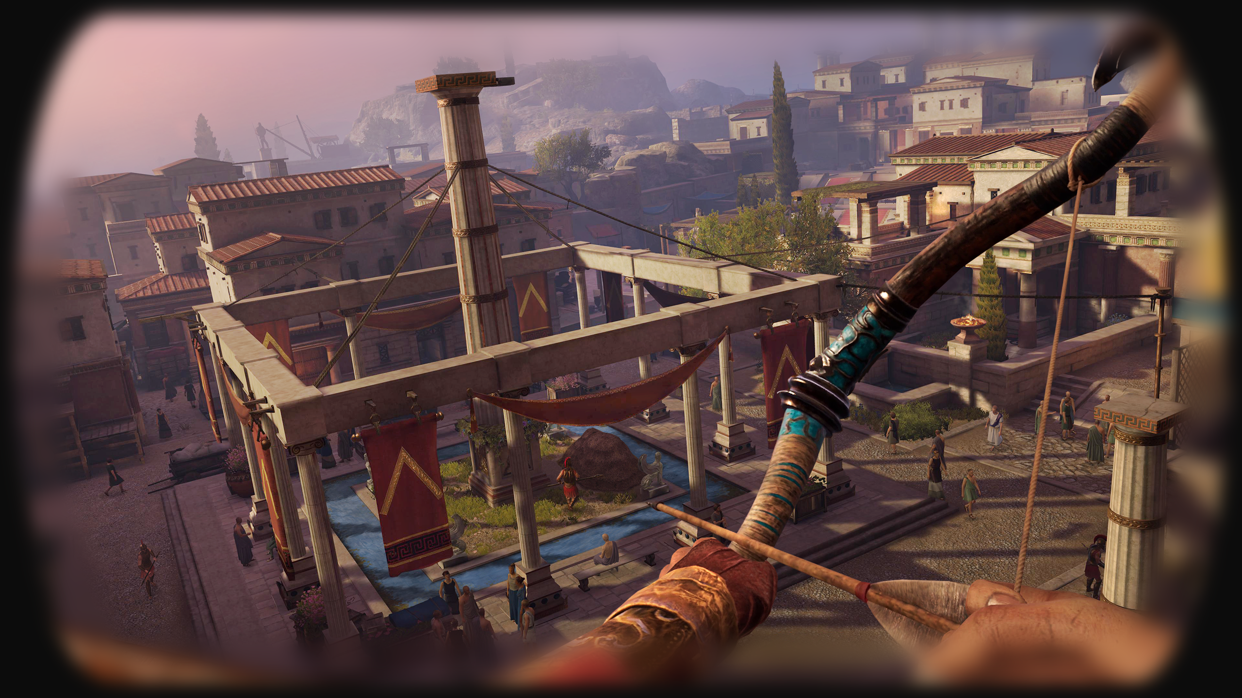
to create an immersive, user centric VR experience that uses diegetic UI and is comfortable for the user. Following assassin creed branding guidelines and to achieve a AAA quality immersive storytelling gaming and vr visual experience.
DESIGN SPRINTS
for the size and complexity of the project agile development was used in jira and confluence. we used two week sprints to closely monitor progress with regular reviews to iterate as quickly as possible. user testing was also crucial to get real user feedback on certain features during playtesting, this helped create a solid backlog that could be prioritised to deliver the best value for the user.
CLOUD MENU |
VR VISUAL CONSTRAINTS
there are alot of constraints when designing a ui for virtual reality, using shapes xr and bezios software helped up contextualise the 3d space and environment that was viewable in the headset.


For the initial concept phase, adobe xd and figma was used, this proved really useful as it it allowed us to visualise all 3 assassins and the content that each screen would need to show in a open 3d environment. the side and front views show the primary and secondary content, this had to be layered in a hierarchy structure to allow the user to easily understand what was interactive and what was not.
LOW-FI PROTOTYPE

Figma - Desktop - interactive prototype linking screens
An interactive clickable wireframe was quickly mocked up, this helped us inform a basic skeleton structure of the cloud menu screens, to get a feel for all the system components and usability elements that would be needed. Figma was used to quickly explore a working clickable prototype that was shared with the team, real users and stakeholders for initial feedback and iterations. Figma software uses vector based graphics to build the foundational UI elements, this makes for an easier way to create a Design System to be scaled and shared across the whole gaming platform.
HI-FI PROTOTYPE

Assassin view - cloud menu - Mockup

Assassin view - cloud menu - Ingame screenshot
A Design System started to be incorporated into the prototype. The foundations of Material Design was used with the basic principles of interactions and animations to allow for a beautiful cross platform experience between all the apps. Using components in Figma meant that the layout and UI components could easily be linked to master components. This sped up the production pipeline especially when shared graphical assets are needed between different menus and features, and coherently communicated information to the user.

Mission view - cloud menu - Mockup

Mission view - cloud menu - Ingame Screenshot
The hi-Fi prototype was used for usability testing to make sure all elements of the design were easily understandable to the user, with a natural cognitive hierarchy for the navigation menu and displayed components. Iterations and design changes were made to the prototype as we progressed with the products development. Once these designs were initially signed off the developers could begin planning for the foundational programmatic approach and which frameworks would be most appropriate to implement, for the success of the product.
DESIGN SYSTEM
again, with further iterations and adjustments on the high-Fidelity prototype this led to creating a primary and secondary colour palette with gradients, images, visual alerts etc. along with the typeface options to remain consistent throughout the Nexus product. Following on from the Nexus branding guidelines a Design System was beginning to be integrated into the product. The colour palettes, typography and UI components are used across different features and menus.

Primary and Secondary Colour Palette options

Font design system
HI-FI PROTOTYPE
A final beautiful clickable prototype was created to allow us to create some reliable usability testing, after several iterations the final aesthetics and user experience was adjusted to suit the users and business requirements. we used some quick prototyping tools in unity to allow us to visualise the prototype in VR and 3D. Where applicable all the animations and interactions were shown in the Figma prototype to give a pixel perfect representation of the final product before it was built. The Figma files were shared with the developers so we could extract code snippets, icons, font sizes, pixel spacing, margins, padding etc with ease. If there was any issues, the problems could be raised and dealt with efficiently to speed up production time.
Once the colour palette and font were selected for the Design System, these primary and secondary colours were used throughout the rest of the onscreen menus and features this allowed for design consistency throughout the nexus product.

Glithy - UI Effects

Controller representation through game

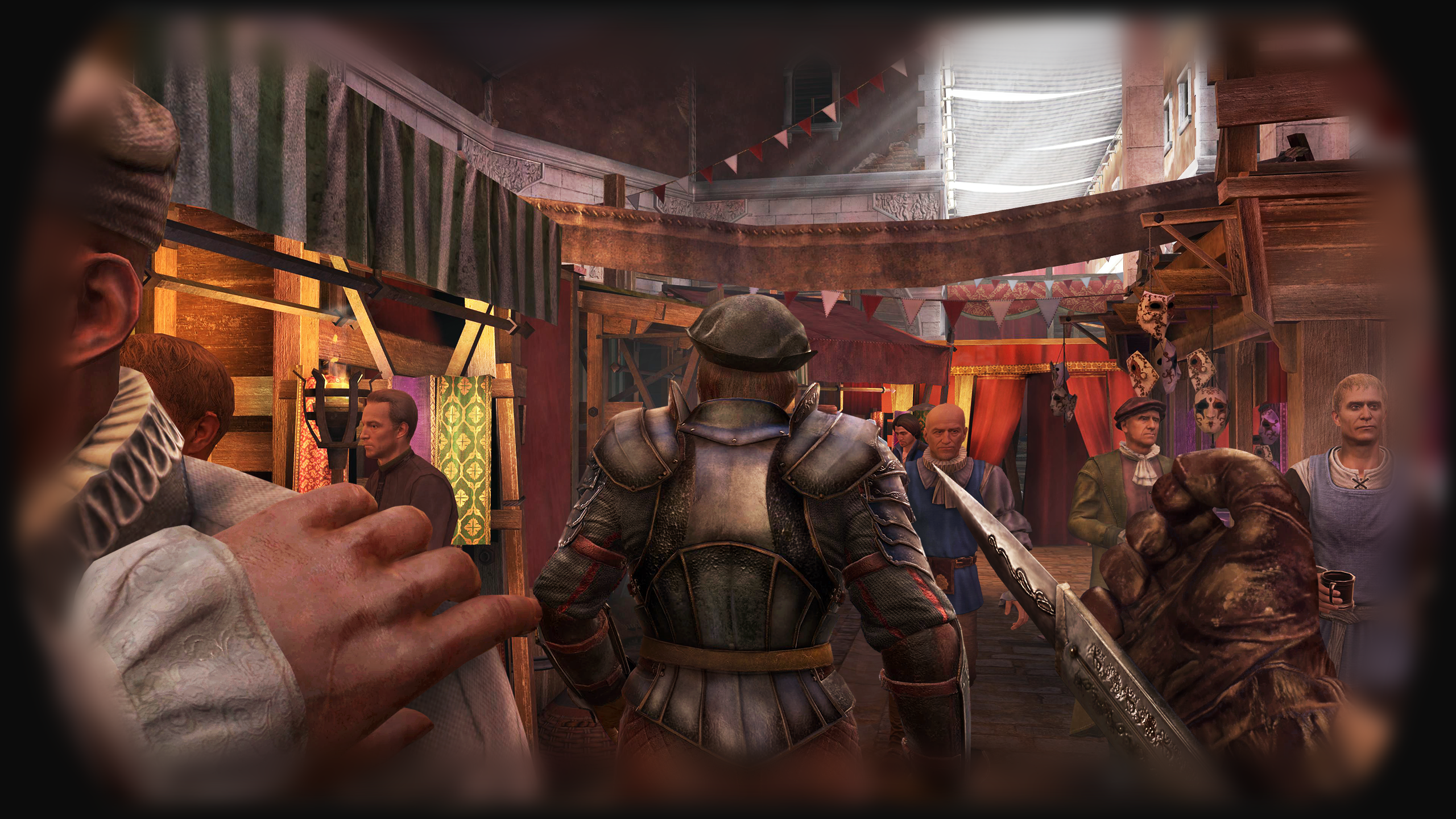
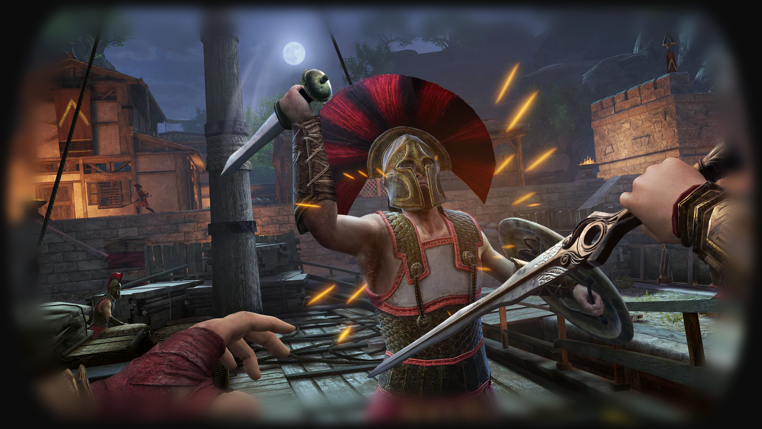
COMBAT HIT DIRECTION STORYBOARD
DESIGN SYSTEM ICONS
An outline icon set was designed for easy recognition and integrated the material design guidelines for the creation of these icons. Most of the icon set was accompanied by text onscreen, but in some cases we had to rely solely on the icon so the icons had to be easily understood , to help guide the user as icons alone can be very confusing for first time users of any product.
Icons - Design System
Icons - Design System

4k atlas for gameplay elements
FURTHER DESIGNS
We had to be responsible for the whole visual UX of the game so combat was very important to link the graphical elements with the rest of the style guide to show the elements in a clear and understandable fashion. We also had to design the controller screen to show the main functions of the controllers, this was part of the main menu screens.


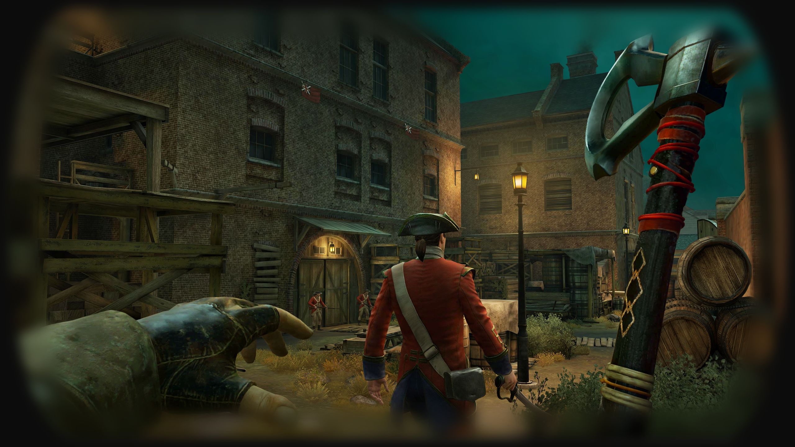
STARTUP PASSTHROUGH SEQUENCE |

from the design sprint workshop that was carried out before the project, the primary objective of the passthrough sequence was to show off the hardware capabilities of the quest 2 passthrough as this was incorporated into the storyline narrative of being in the present day and then being transported into the memories of the assassins which would be in full vr mode. As the sequence was going to contain hacking puzzles and interactive elements careful consideration had to be taken to allow for the interactive elements to be within the user reach, so a lot of elements where placed within an interactive boundary for the user. For simplicity the main users controller was displayed as a circular ring and a bright dot as this was the physical controller in the passthrough mode for both the left and right controller.
research / reference / inspiration

After plenty of sketching ideas and task flows, I wanted to understand a 3D spatial interface and how we would tackle the problem ahead. Some cardboard mockups and 3d objects where placed in different environments to visualise how the user could potentially interact with the 3D spatial interface.
storyboards
A quick 2D clickable prototype was mocked up for the flow of the quest 2 passthrough, the real challenge was the limited field of view, navigating gestures in the headset and to make the UX aesthetically clean and easily understandable with ease of use for being interactive .

pass through video
Below shows the passthrough video on the quest 2, on the quest 3 the outward camera are displayed in much higher resolution and in full colour, the quest 2 cameras are only displayed in grayscale.


LESSONS LEARNED |
performance testing
It was critical to try and hit 90FPS with the Quest 2 as when complex shaders and lots of geometry where introduced there where significant performance issues. When the frame rate of the Quest 2 drops under 60 FPS there was noticeable latency which led to nausea for the user, so aiming for 90FPS was the teams benchmark to achieve a comfortable experience for the user, this allowed us to have a buffer as we wanted to hit 75fps as a minimum which does happen in some areas of the gameon the quest 2, but on the quest 3 the target frame rate is 90fps which we achieved throughout the game. To achieve this we used optimised shaders, geometry, limited living world objects and other code optimisations. The ingame UI was created to use 1 draw call we did this by using a 4K atlas and using our own quasar single layered rendered plugin.
interactions
the interactions were key to provide the user in a fully immersive environment, we used a simple left and right handed icon dot that snapped to interactive objects in the game world. Almost everything was interactive in the world this also meant climbing, parkouring and mantling also needed grab handles to appear to show the user that they could interact with the world. We had to limit the number of ingame world objects that were interactable so we used big and heavy objects to show the player that they couldnt interact with these objects.
audio fx
working closely with the audio team meant we had audio FX for most things ingame like objects smashing, throwing things that created sound to distract guards ingame as well. We used subtle audio FX to indicate to the player that they had completed a successful action and this was really useful coupled with haptic feedback in the controllers to create a fully immersive experience.
user testing
User testing was so important throughout the development life cycle and actually allowed us to iterate quickly on designs that were’nt obvious or sometimes confusing to the player. Working with the UX research team allowed us to setup tests and quickly get feedback that was needed to change or iterate on designs. user testing in the project proved vital to the success of flows and features of the game, so it was a shame we couldnt do more testing on some features but we ran out time to user test everything in the game, which proved a little damaging in some aspects of the game.